|
|
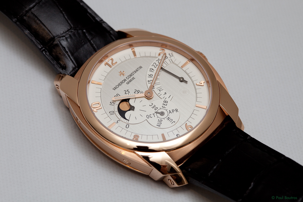
Featuring Vacheron's first ever movement with an annual calendar complication the immediate differences one notices over the original QDI models are the larger, 43 mm case, and the solid, non-transparent dial. The emphasis on anti-counterfeiting and robust security measures, although still present, has clearly taken a backseat on this new version. Case metal options have been limited to more traditional precious metals - pink gold, white gold, or a combination of both, further aligning the watch more closely with Vacheron's conservative reputation.
The QDI RAC Dial
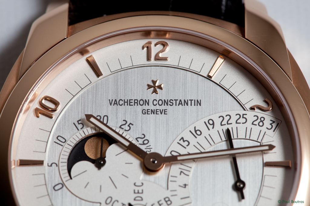
Fitted with a two-level dial with two different finishes on each level - opaline for the dial's raised outer zone and sub-dials, and vertical brushing on the lower, central zone...

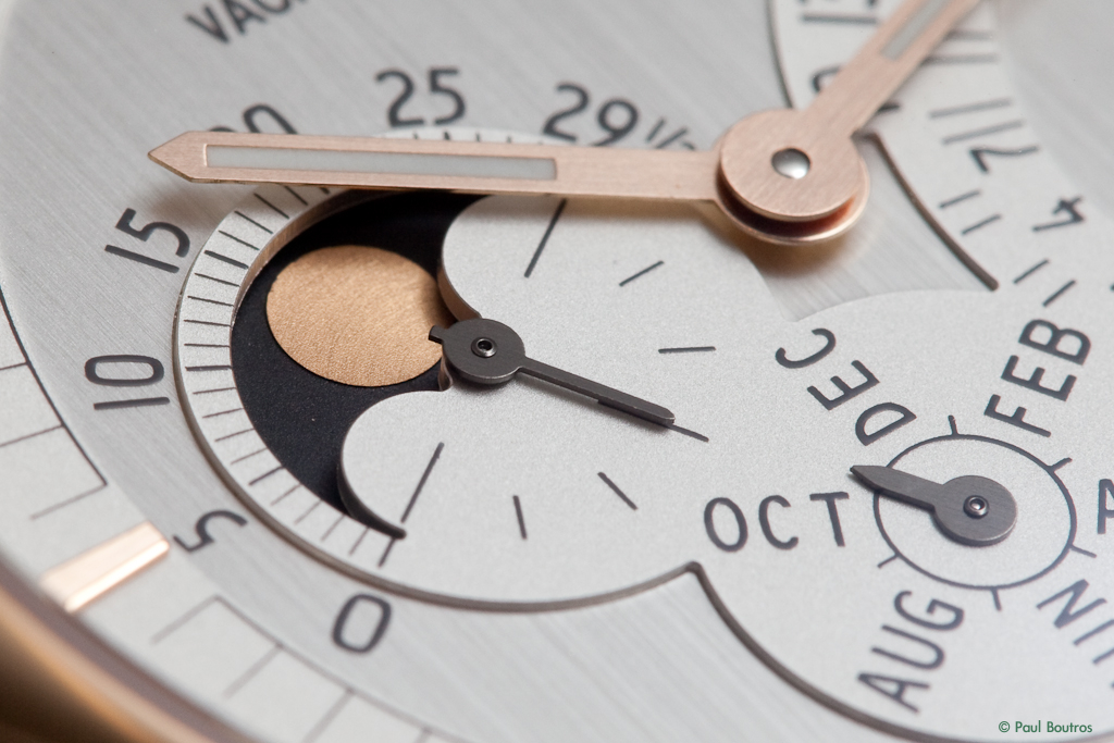
The moonphase and seconds are indicated on the same sub-dial, with the age of the moon in days printed on the lower su**ce of the dial. The lower portion of this sub-dial is printed with a scale for the continuous seconds, which the seconds hand extends into. This sub-dial and the month sub-dial are merged, angled, and offset from center, both with flat, and rather small, black hands...

The brushed gold moon is very simple and flat, set within a black background...
The retrograding date is indicated on a raised sector, with numeric indicators for every third day...
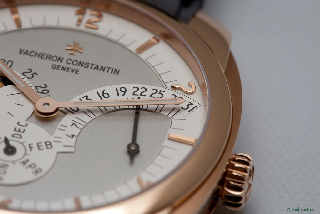
Note how light plays with the textures of the dial...the opaline su**ce appears to be finely grained in this photo...

The lines and numbers are spaced tightly, which made it a little difficult for me to quickly read the correct date.
The dial uses applied rose gold baton markers and Arabic hour markers. The tapered baton markers feature a stepped, polished ridge from the bottom to the brushed-finish top, allowing light to reflect ...

Each Arabic numerals is beautifully and impressively finished, with vertically brushed top su**ces, polished and beveled angles, and mirror polished sides...

A sun motif inspired by the Tour de l'Ile's clock tower next to Vacheron's historic Geneva headquarters is printed in invisible ink at 4 o'clock. It's a subtle anti-counterfeiting element retained from the original QDI models that glows when exposed to ultra-violet light...

An unusual dial element retained from the originals is this silver dot, positioned between the 6 o'clock and 7 o'clock markers. According to Vacheron's Alex Ghotbi, its purpose was to assist with placement of the transparent dials. On this watch, it should be eliminated...

Below is a shot of the baton-shaped hour and minute hands. They're brushed finished with luminous material. Like the sub-dial hands and moonphase, they're very flat, and to be frank, boring. It would be great if some faceting or anglage was used to add some character. On a more positive note, it's very easy to tell the time on this model...

The QDI RAC Case
Measuring 43 mm in diameter, with a length of 54 mm, the case's diameter was expanded by 2 mm over the originals, yet the thickness, at 13 mm, remains the same. The last point is impressive, considering the significant increase in parts required by the annual calendar and retrograding date complications.
Side-by-side with a QDI Day-Date model in titanium and rose gold...

The QDI RAC is taller and wider, but has the same thickness...


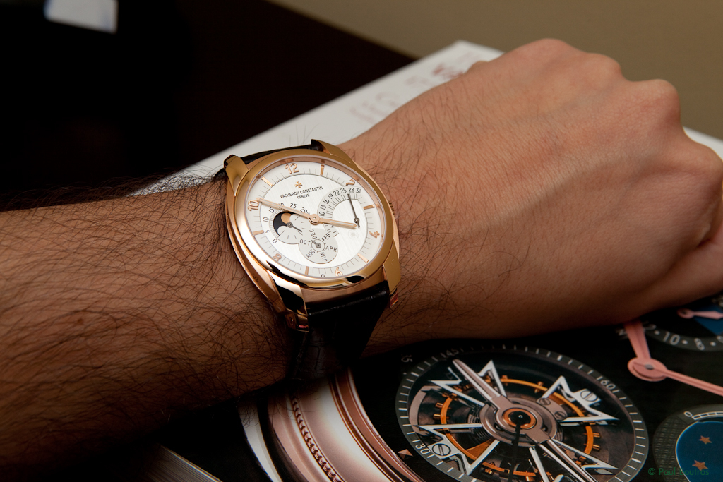
The length, diameter, and thickness are well-proportioned, making the watch very wearable for even those with small wrists (like me!)...

The modular, tonneau-shaped case is composed of a seven-part mid-section, a polished bezel, and a screw-down caseback fitted with a sapphire crystal. The seven parts include:
* Lateral flanks on the sides of the case (2 pieces at 3 and 9 o'clock)
* Lugs (2 parts at 12 and 6 o'clock)
* Inter-lug segments (2 parts between the lugs at 12 and 6 o'clock)
* A support plate to which the caseback is secured
Rose or white gold can be chosen for these elements, as well as the bezel and crown, enabling some interesting, and personalized, configurations.
The case parts are either mirror polished or satin-finished, with finely polished and beveled edges and transitions...
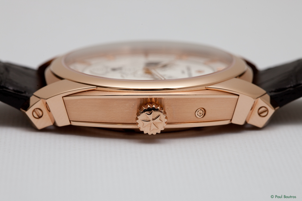
The massive, stepped lugs have an art-deco-inspired aesthetic, and combine elegantly with the case's lateral flanks. Superb finishing can be seen throughout...

The inter-lug segments are brushed finished and add to the appeal of the case...

The crown is large, handsome, and easy to use...

The watch comes with a very high quality deployant clasp in the shape of half of the Maltese cross. As this was a demonstration model, the strap was fake crocodile (used, I'm sure, to ease customs issues when shipping overseas) and the deployant was gold-plated steel.
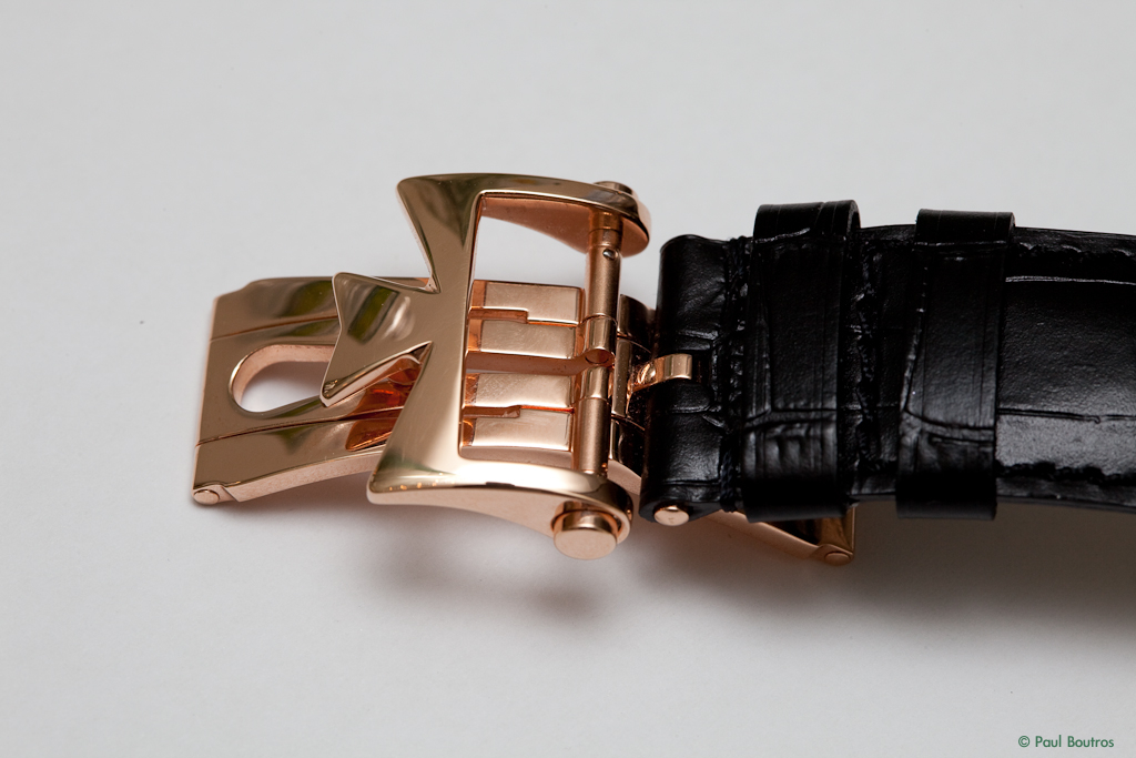
Before I could wear it, I needed to adjust the notch...

It's screwed into the strap for security...
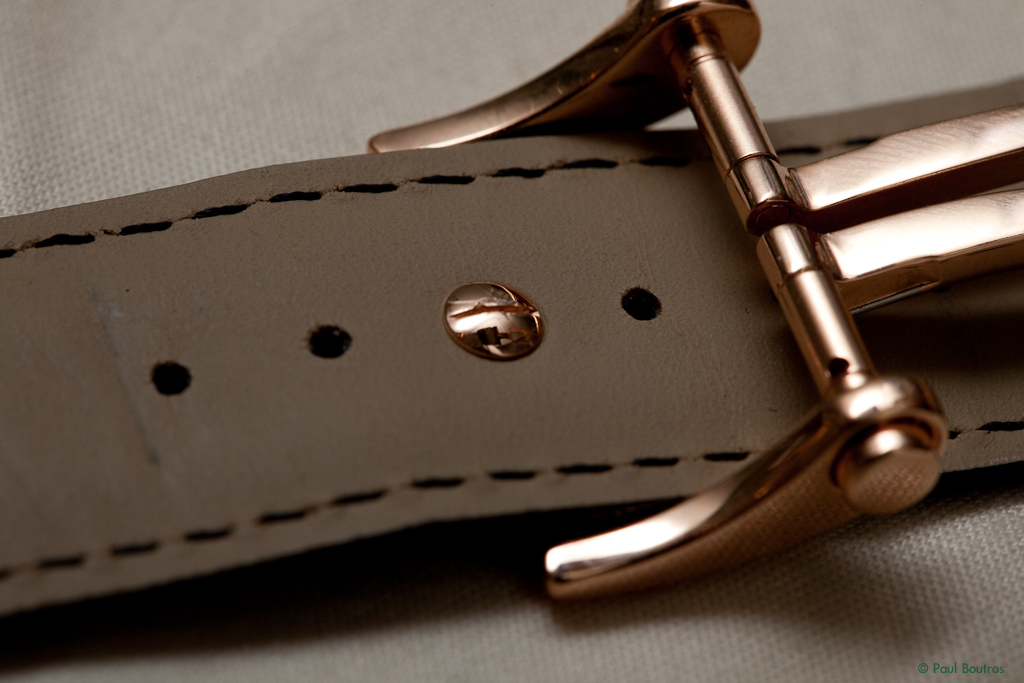

Perfect fit...

The QDI RAC Movement
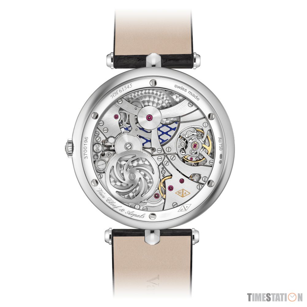
Like all QDI watches, the QDI RAC's movement is based on Vacheron's state-of-the-art, in-house designed and manufactured self-winding movement, the caliber 2460, launched in 2005. It provides 40 hours of power reserve and is equipped with a stop-seconds feature to facilitate precise time setting. Stamped with the Geneva Seal, the 2460 is a robust, high-grade, and well-finished caliber, enhancing the exclusivity of the QDI product line...
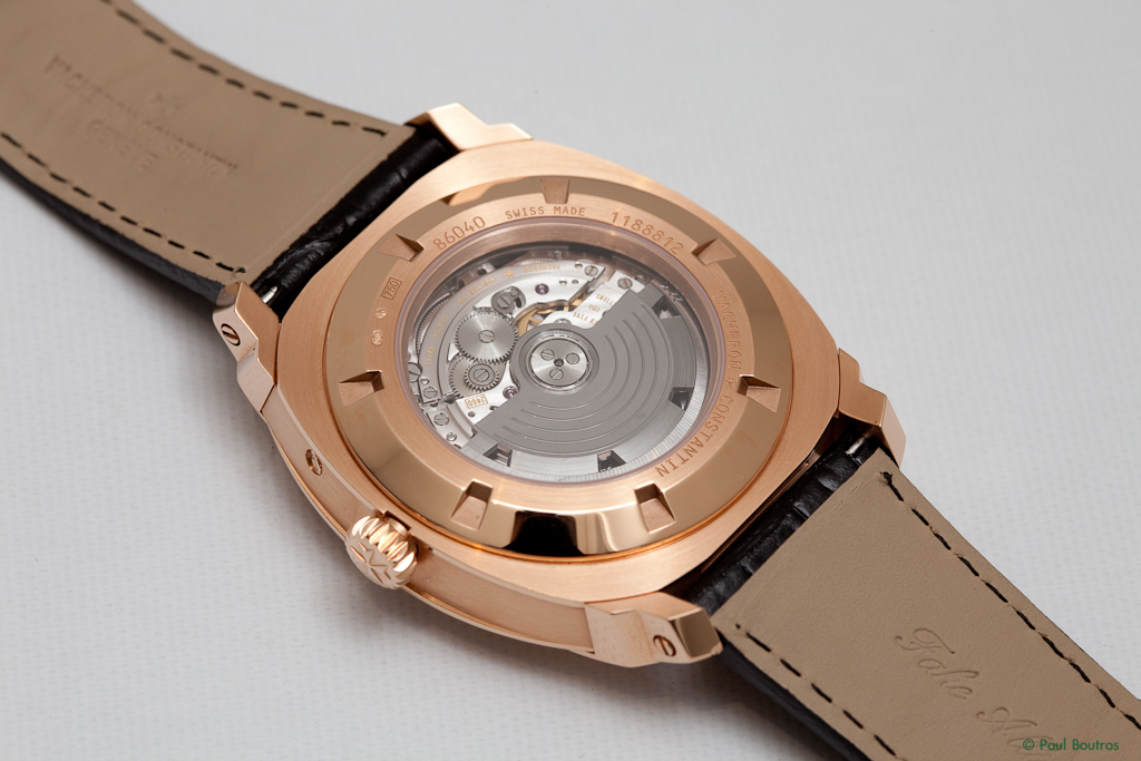
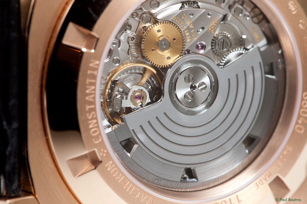
Other features include an annual calendar complication requiring adjustment just once per year at the end of February and a retrograding date display. The high-precision moonphase complication requires correction once every 122 years. The rotor is ruthenium-plated 22 karat gold, with five decorative "fillets", mounted on ceramic ball bearings...

Conclusions
An unexpected thing happened for the short period of time I wore the watch. Random people were staring at my wrist and providing unsolicited comments on how much they liked it. The amount of attention and notice the QDI RAC drew from friends and strangers alike was surprising. People WILL notice this watch, and they will be impressed.
When I first heard the QDI RAC's case had grown by 2 mm, I thought for sure it would be too big for my 6.75" wrist. It turns out, the size was just fine for me. It was extremely comfortable and a joy to wear. Yes, the date is a little difficult to read, but the extra moment or two required force you to enjoy the watch.
If I could change one thing, it would be the hands. In such a high-end, well finished watch, the ones currently fitted underwhelm.
Kudos to Vacheron for continuing to develop the Quai de l'Ile product line - it's a unique, high-end, and contemporary design retaining an overall aesthetic that is true to the brand's traditional roots. Introducing an annual calendar, an all new complication for the brand, in the Quai de l'Ile was a great move, providing much-needed mechanical innovation and excitement to the line.
Special thanks to the lovely Ellen Sorensen of Vacheron Constantin North America for allowing me to be one of the first people in the US to see and wear the watch.
|
|
